
A basic scatter plot has a set of points plotted at the intersection of their values along X and Y axes. Sometimes, we may wish to further distinguish between these points based on another value associated with the points. In this recipe we will see how we can group data points using color.
To try out this recipe, start R and type the recipe at the command prompt. You can also choose to save the recipe as a script so that you can use it again later on.
We will also need the lattice and ggplot2 packages. The lattice package is included automatically in the base R installation, but we will need to install the ggplot2 package. To do this, run the following command at the R prompt:
install.packages("ggplot2")As a first example, let's use the xyplot() command of the lattice library:
library(lattice)

xyplot(mpg~disp,
data=mtcars,
groups=cyl,
auto.key=list(corner=c(1,1)))

In the example, we used the
xyplot() command to plot mpg versus disp from the pre-loaded mtcars dataset. We will understand this better if we look at the actual dataset. Type mtcars at the R prompt and hit Enter. Let's look at a sample of the data to see the row names and first three columns of data:
mtcars[1:6,1:3]
                       mpg   cyl   disp
Mazda RX4             21.0     6    160
Mazda RX4 Wag         21.0     6    160
Datsun 710            22.8     4    108
Hornet 4 Drive        21.4     6    258
Hornet Sportabout     18.7     8    360
Valiant               18.1     6    225
So we plotted mpg against disp, but we also used the groups argument to group the data points by cyl. That tells xyplot() that we would like to highlight the data points by different colors based on the number of cylinders (cyl) each car has. Finally, the auto.key argument is set to add a legend so that we know what values of cyl each color represents. The auto.key argument can take a list of values. The only one we have provided here is the location given by the corner argument, which we set to c(1,1) representing the top right corner. We can also simply set auto.key to TRUE, which will draw the legend in the top margin outside the plotting area.
The xyplot() function has slightly obscure arguments. If you look at the help file on xyplot() (by running ?xyplot), you will see that there are a lot of arguments which can be used to control many different aspects of the graph. A simpler alternative to xyplot() is using the functions from the ggplot2 package. Let's draw the same plot using ggplot2:
library(ggplot2)
qplot(disp,mpg,data=mtcars,col= as.factor(cyl))
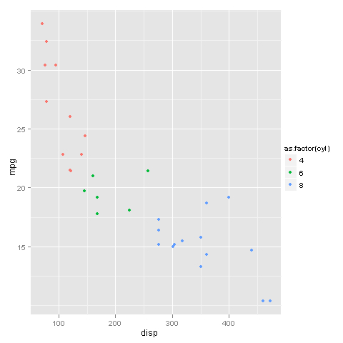
First we load the ggplot2 library and then use the
qplot() function to make the previous graph. We passed disp and mpg as the x and y variables respectively (note we can't use the y~x notation in qplot). To group by cyl, all we had to do was set the col argument to cyl. This tells qplot that we want to group the points based on the values of cyl and represent them by different colors. The legend is automatically drawn to the right.
Note that we set col to as.factor(cyl) and not just cyl. This is to make sure that cyl is read as a factor (or categorical value). If we just use cyl, then the plot is still the same, but the color scale and legend uses all the values between 4 and 8 as it takes cyl as a numerical variable.
Thus, it is easier and more intuitive to produce a better looking graph with ggplot2.