
Controlling the Axes
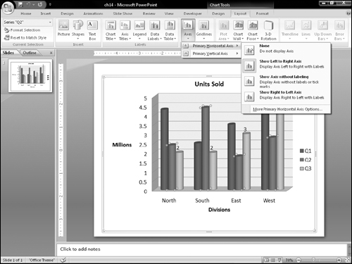
No, axes are not the tools that chop down trees. Axes is the plural of axis, and an axis is the side of the chart containing the measurements against which your data is plotted. For example, in Figure 23-48, the horizontal axis contains the names of the divisions, and the vertical axis contains million-unit amounts (0 through 5).
You can change the various axes in a chart in several ways. For example, you can make an axis run in a different direction (such as from top-to-bottom instead of bottom-to-top for a vertical axis), and you can turn the text on or off for the axis and change the axis scale.
Using axis presets
You can select some of the most popular axis presets using the Axes button on the Layout tab. As with the axis titles that you learned about earlier in this chapter, there are separate submenus for horizontal and vertical axes. Figure 23-48 shows the options for horizontal axes, and Figure 23-49 shows those for vertical axes.

Setting axis scale options
The scale determines which numbers will form the start and end points of the axis line. For example, take a look at the chart in Figure 23-50. The bars are so close to one another in value that it is difficult to see the difference between them. Compare this chart to one showing the same data in Figure 23-51, but with an adjusted scale. Because the scale is smaller, the differences now appear more dramatic.
Figure 23-50. This chart does not show the differences between the values very well.

Figure 23-51. A change to the values of the axis scale makes it easier to see the differences between values.

Tip
You will probably never run into a case as dramatic as the difference between Figures 23-50 and 23-51 because PowerPoint’s charting feature has an automatic setting for the scale that is turned on by default. However, you may sometimes want to override this setting for a different effect, such as to minimize or enhance the difference between data series. This is a good example of “making the data say what you want.” For example, if you wanted to make the point that the differences between three months were insignificant, then you would use a larger scale. If you wanted to highlight the importance of the differences, then you would use a smaller scale.
To set the scale for an axis, follow these steps:
1. | On the Layout tab, choose Axes Figure 23-52. You can set axis options in the Format Axis dialog box, including the axis scale.
|
2. | Drag the Format Axis dialog box to the side so that you can see the results on the chart. |
3. | If you do not want the automatic value for one of the measurements, click Fixed and enter a different number in its text box.
|
4. | (Optional) If you want to activate any of these special features, select their checkboxes. Each of these checkboxes recalculates the numbers in the Minimum, Maximum, Major Unit, and Minor Unit text boxes.
|
5. | (Optional) You can set a display unit to simplify large numbers. For example, if you set display units to Thousands, then the number 1000 appears as “1” on the chart. If you then select the Show Display Units Label on Chart checkbox, an axis label will appear as “Thousands.” |
6. | (Optional) You can set tick-mark types for major and minor marks. These marks appear as little lines on the axis to indicate the units. You can use tick marks either with or without gridlines. (To set gridlines, use the Gridlines button’s menu on the Chart Tools Layout tab.) |
7. | If you are happy with the results, click Close. |

Setting a number format
You can apply a number format to axes and data labels that show numeric data. This is similar to the number format that is used for Excel cells; you can choose a category, such as Currency or Percentage, and then fine-tune this format by choosing a number of decimal places, a method of handling negative numbers, and so on.
To set a number format, follow these steps:
1. | Right-click the axis and choose Format Axis. |
2. | In the Format Axis dialog box that appears, click Number. A list of number formats appears. |
3. | (Optional) You can select the number format in two ways: the first way is to select the Linked to Source checkbox if you want the number format to be taken from the number format that is applied to the datasheet in Excel. The second way is to click the desired number format in the Category list. Options appear that are specific to the format that you selected. For example, Figure 23-53 shows the options for the Number type of format, which is a generic format. Figure 23-53. You can set a number format in the Format Axis dialog box.
|
4. | (Optional) You can fine-tune the numbering format by changing the code in the Format Code text box. The number signs (#) represent optional digits, while the zeroes represent required digits. |
5. | Click Close to close the dialog box. |

Note
To see some examples of custom number formats that you might use in the Format Code text box, choose Custom as the number format.