
Understanding Chart Types
People who create charts usually do so to make a point or to communicate a specific message. Often, the message is explicitly stated in the chart’s title or in a text box within the chart. The chart itself provides visual support.
Choosing the correct chart type is often a key factor in the effectiveness of the message. Therefore, it’s often well worth your time to experiment with various chart types to determine which one conveys your message best.
In almost every case, the underlying message in a chart is some type of comparison. Examples of some general types of comparisons include:
Compare item to other items: For example, a chart may compare sales in each of a company’s sales regions.
Compare data over time: For example, a chart may display sales by month and indicate trends over time.
Make relative comparisons: An example is a common pie chart that depicts relative values in terms of pie “slices.”
Compare data relationships: An XY chart is ideal for this comparison. For example, you might show the relationship between marketing expenditures and sales.
Frequency comparison: You can use a common histogram, for example, to display the number (or percentage) of students who scored within a particular grade range.
Identify “outliers” or unusual situations: If you have thousands of data points, creating a scatter chart may help identify data that is not representative.
Choosing a chart type
A common question among Excel users is “How do I know which chart type to use for my data?” Unfortunately, this question has no cut-and-dried answer to. Perhaps the best answer is a vague one: Use the chart type that gets your message across in the simplest way.
Figure 18-11 shows the same set of data plotted by using six different chart types. Although all six charts represent the same information (monthly Web site visitors), they look quite different from one another.
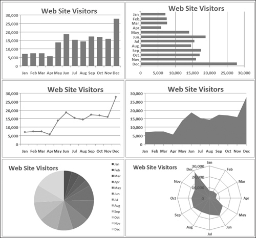
The column chart (upper left) is probably the best choice for this particular set of data because it clearly shows the information for each month in discrete units. The bar chart (upper right) is similar to a column chart, but the axes are swapped. Most people are more accustomed to seeing time-based information extend from left to right rather than from top to bottom.
The line chart (middle left) may not be the best choice because it seems to imply that the data is continuous—that points exist in between the 12 actual data points. This same argument may be made against using an area chart (middle right).
The pie chart (lower left) is simply too confusing and does nothing to convey the time-based nature of the data. Pie charts are most appropriate for a data series in which you want to emphasize proportions among a relatively small number of data points. If you have too many data points, a pie chart can be impossible to interpret.
The radar chart (lower right) is clearly inappropriate for this data. People aren’t accustomed to viewing time-based information in a circular direction!
Fortunately, changing a chart’s type is an easy procedure, so you can experiment with various chart types until you find the one that represents your data accurately, clearly, and as simply as possible.