Hands On: Creating and Customizing a Chart
This section contains a step-by-step example of creating a chart and applying some customizations. If you’ve never created a chart, this is a good opportunity to get a feel for how it works.
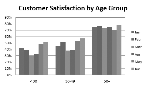
Figure 18-3 shows a worksheet with a range of data. This data is customer survey results by month, broken down by customers in three age groups. In this case, the data resides in a table (created by choosing Insert ![]() Tables
Tables ![]() Table), but that’s not a requirement to create a chart.
Table), but that’s not a requirement to create a chart.
Figure 18-3. The source data for the hands-on chart example.

Selecting the data
The first step is to select the data for the chart. Your selection should include such items as labels and series identifiers (row and column headings).
For this example, select the range B4:E10. This range includes the category labels but not the title (which is in B1).
Note
The data that you use in a chart need not be in contiguous cells. You can press Ctrl and make a multiple selection. The initial data, however, must be on a single worksheet. If you need to plot data that exists on more than one worksheet, you can add more series after the chart is created. In all cases, however, data for a single chart series must reside on one sheet.
Choosing a chart type
After you’ve selected the data, select a chart type from Insert ![]() Charts. Each control in this group is a drop-down list, which lets you further refine your choice by selecting a subtype.
Charts. Each control in this group is a drop-down list, which lets you further refine your choice by selecting a subtype.
For this example, choose Insert ![]() Charts
Charts ![]() Column
Column ![]() Clustered Column. In other words, you’re creating a column chart, using the clustered column subtype. Excel displays the chart shown in Figure 18-4.
Clustered Column. In other words, you’re creating a column chart, using the clustered column subtype. Excel displays the chart shown in Figure 18-4.

Experimenting with different layouts
The chart shown in Figure 18-4 looks pretty good, but it’s just one of several predefined layouts for a clustered column chart.
To see some other configurations for the chart, select the chart and apply a few other layouts in the Chart Tools ![]() Design
Design ![]() Chart Layouts group.
Chart Layouts group.
Note
Every chart type has a set of layouts that you can choose from. A layout contains additional chart elements, such as a title, data labels, axes, and so on. You can add your own elements to your chart, but often using a predefined layout saves time. Even if the layout isn’t exactly what you want, it may be close enough that you need to make only a few adjustments.
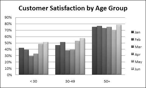
Figure 18-5 shows the chart after selecting a layout that adds a chart title and moves the legend to the bottom.
Figure 18-5. The chart, after selecting a different layout.
The chart title is a text element that you can select and edit. Alternatively, you can link the chart title to a cell so the title always displays the contents of a particular cell. To create a link to a cell, click the chart title, type an equal sign (=), and click the cell. Excel displays the link in the Formula bar. In the example, the contents of cell A1 is perfect for the chart title.
Experiment with the Chart Tools ![]() Layout tab to make other changes to the chart. For example, you can remove the grid lines, add axis titles, relocate the legend, and so on. Making these changes is easy and intuitive.
Layout tab to make other changes to the chart. For example, you can remove the grid lines, add axis titles, relocate the legend, and so on. Making these changes is easy and intuitive.
Trying another view of the data
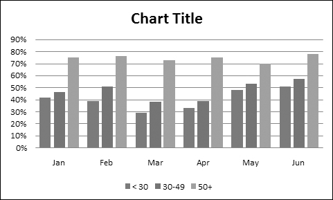
The chart, at this point, shows six clusters (months) of three data points in each (age groups). Would the data be easier to understand if we plotted the information in the opposite way?
Try it. Select the chart and then choose Chart Tools ![]() Design
Design ![]() Data
Data ![]() Switch Row/Column. Figure 18-6 shows the result of this change. I also selected a different layout, which provides more separation between the three clusters.
Switch Row/Column. Figure 18-6 shows the result of this change. I also selected a different layout, which provides more separation between the three clusters.
Figure 18-6. The chart, after changing the row and column orientation.
Note
The orientation of the data has a drastic effect on the look of your chart. Excel has its own rules that it uses to determine the initial data orientation when you create a chart. If Excel’s orientation doesn’t match your expectation, it’s easy enough to change.
The chart, with this new orientation, reveals information that wasn’t so apparent in the original version. The <30 and 30–49 age groups both show a decline in satisfaction for March and April. The 50+ age group didn’t have this problem, however.
Trying other chart types
Although a clustered column chart seems to work well for this data, there’s no harm in checking out some other chart types. Choose Design ![]() Type
Type ![]() Change Chart Type to experiment with other chart types. This command displays the Change Chart Type dialog box, shown in Figure 18-7. The main categories are listed on the left, and the subtypes are shown as icons. Select an icon, click OK, and Excel displays the chart using the new chart type. If you don’t like the result, select Undo.
Change Chart Type to experiment with other chart types. This command displays the Change Chart Type dialog box, shown in Figure 18-7. The main categories are listed on the left, and the subtypes are shown as icons. Select an icon, click OK, and Excel displays the chart using the new chart type. If you don’t like the result, select Undo.

Figure 18-8 shows a few different chart type options.
Figure 18-8. The customer satisfaction chart, using four different chart types.

Trying other chart styles
If you’d like to try some of the prebuilt chart styles, select the chart and choose Chart Tools ![]() Design
Design ![]() Chart Styles gallery. You’ll find an amazing selection of different colors and effects, all available with a single mouse click.
Chart Styles gallery. You’ll find an amazing selection of different colors and effects, all available with a single mouse click.
Tip
The styles displayed in the gallery depend on the workbook’s theme. When you choose Page Layout ![]() Themes to apply a different theme, you’ll have a new selection of chart styles designed for the selected theme.
Themes to apply a different theme, you’ll have a new selection of chart styles designed for the selected theme.
Figure 18-9 shows the chart after drastically changing its appearance by applying a new chart style, which adds a three-dimensional look to the columns.
Figure 18-9. A single click applies a new style and dramatically changes the chart’s look.