Extensions, as the name suggests, allow you to extend the power of Qlik Sense by creating your own charts and graphs using the Qlik Sense APIs. Assume that you want to show some analysis to your business users but it cannot be shown using the available visualization library. In such cases, Qlik Sense allows you to create your own charts and use them in Qlik Sense application.
Qlik Sense has exposed several APIs to extend the capabilities of Qlik Sense. One of such APIs is visualization API. These are the same APIs that are used by Qlik Sense to create its own inbuilt visualizations.
If you are well versed with web technology like HTML and scripting like JavaScript, then you can easily create your own extensions. You can also use third-party APIs and visualization libraries, like D3, Chart.js, Echarts, and so on.
Let us have a look at few extensions which will ease your development and help in making more interactive dashboards:
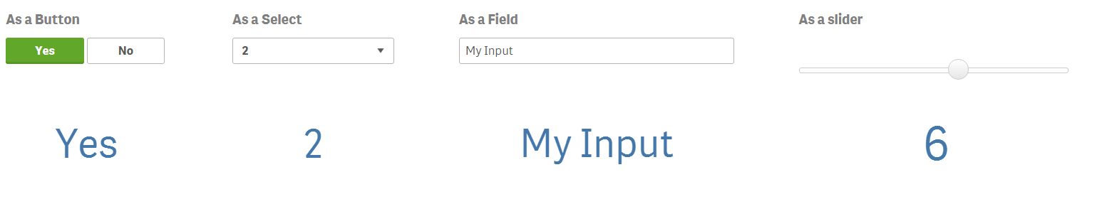
- qsVariable: One of the good extensions is the qsVariable. It helps to set a variable value in four ways, namely as a button, select, field, and slider. Variables are very useful while developing the dashboards and in filtering the data to find the analytics from the data.
The qsvariable extension was developed by Erik Wetterberg. The extension can be downloaded from http://branch.qlik.com/#!/project/56728f52d1e497241ae697f8.
- Trellis chart: One of the wonderful visualizations, which I feel is missing in Qlik Sense, is trellis chart. Trellis chart helps to look at the same chart with different dimension values. It creates mirror of the charts with different values of the defined dimension. That eventually makes it easier to compare the KPIs. Trellis chart extension was developed by Michael Laenen. The trellis chart can be download from http://branch.qlik.com/#!/project/5718fb1d80955830cdd6e7fb.
It can create trellis for various chart types, such as bar charts, line charts, pie charts, area charts, lollipop charts, and step charts.
Following are some trellis chart extension screenshots:

- Tabbed container extension: One of the best ways to utilize the canvas to show a number of charts is the container object. This extension can be compared to the container object of QlikView. It allows you to create a different tab for different charts.
It is limited to only five tabs and it takes the visualization from the master library. So to add any visualization in a tab in this extension, you will have to first create a visualization in master library.
This extension is available to download from http://branch.qlik.com/?_ga=1.118094281.1597184826.1442399999#!/project/5925830c89eaeeb085775473.
Following is a sample screenshot of this extension:

- Interactive Timeline: One of the missing charts, which should have been included as a default chart, is Gantt chart. Gantt charts are very useful when you want to show the progress of projects over a time. This extension helps in achieving the same.
This extension was developed by Ralf Becher. It is available for download from http://branch.qlik.com/#!/project/56728f52d1e497241ae6989d.
Following is a screenshot of interactive timeline chart:

- Sheet Navigation + Actions for Qlik Sense: This is a very useful extension, which helps in easy navigation along with the actions. This extension can perform many actions which you may require on every dashboard, such as making a selection, applying bookmarks, clearing the sections, and so on. This extension was developed by Stefen Walther. It can be downloaded from http://branch.qlik.com/#!/project/56728f52d1e497241ae698a0h
Following is a screenshot of the extension:

- SimpleKPI: If you want to show the KPIs on the dashboard, I would suggest you to go for this extension. It allows you to arrange your KPIs in the best way. You can also include symbolic indication along with your KPI. It can also show the trends of the KPI. One of the good parts of this extension is that it can repeat the icon multiple times to represent the value of the KPI.
It was developed by Alex Nerush. It is available for download from http://branch.qlik.com/#!/project/5677d80b7f70718900987bff.
Following is a sample SimpleKPI image:

- BarsPlus: The default bar charts do not have much formatting options. So if you are looking for a bar with more formatting options, then one of the extensions I would suggest is BarsPlus. Apart from the formatting options, the bars can also be visualized in a better way.
It is developed by Larry Woodside. It can be downloaded from http://branch.qlik.com/#!project/5858f900c0568806cf368930
Following is a sample screenshot of the extension:
